前回、はてなブログのcssを使って見出しのデザインをカスタマイズする準備が整いました。
そこで今回は実際に見出しのデザインcssをカスタマイズしていきましょう。
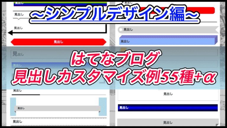
今回紹介するのは「シンプル」な見出しデザインです。
もくじ
はじめに
前回は、はてなブログでcssを使った見出しデザインをカスタマイズする準備が整いました。
テーマによる注意点なども合わせて紹介しているので、前回の記事をまだ確認していない方は確認してみてください。
【はてなブログ】cssの見出しカスタマイズ例50種+α!準備編
【はてなブログ】css飲み出しカスタマイズ例50種+α!シンプルデザイン編
【はてなブログ】cssの見出しカスタマイズ例50種+α!上級デザイン編
では、早速見出しをカスタマイズしていきましょう。
今回の記事では、シンプルなデザインを紹介します。
枠のみ
まずは、枠だけの見出しです。

.entry-content h2{
  border: 1px solid black;
  padding: 10px;
}
このようなコードを追加してください。
見出しのテキストを真ん中に表示
先ほどのシンプルな見出しで、見出しのテキストを真ん中に表示させています。

.entry-content h2{
  padding: 10px;
  border: 1px solid black;
  text-align: center;
}
左側に帯
次は左側の枠線だけを太くしてみます。

.entry-content h2{
  padding: 10px;
  border: 1px solid black;
  border-left: 10px solid black;
}
左側だけ太くする
先ほどと同じように見えますが、今度は枠線は無しにして左側の帯だけを表示させました。

.entry-content h2{
  border: 0;
  border-left: 10px solid black;
  padding: 10px;
}
上下にボーダー
上下のみ直線を表示させます。

.entry-content h2{
  padding: 10px;
  border: 0;
  border-top: 3px solid black;
  border-bottom: 3px solid black;
}
左に帯+アンダーライン
次は、左側に太いボーダーとアンダーラインのみの見出しです。

.entry-content h2{
  padding: 10px;
  border: 0;
  border-left: 10px solid black;
  border-bottom: 1px solid black;
}
二重のアンダーライン

見出しの下線を二重にしました。
.entry-content h2{
  padding: 10px;
  border-bottom: 3px double black;
}
シンプルな吹き出し

続いて、よく見るシンプルな吹き出しを作ってみました。
.entry-content h2{
  padding: 10px;
  border: 1px solid black;
  background-color: white;
  position: relative;
}
.entry-content h2:before,
.entry-content h2:after{
  content: "";
  position: absolute;
  border: 10px solid transparent;
  top: 100%;
  left: 20px;
}
  .entry-content h2:before{
  border-top: 10px solid black;
}
.entry-content h2:after{
  border-top: 10px solid white;
  margin-top: -1px;
}
このようにシンプルな吹き出しが完成しました。
上下ボーダー+吹き出し
上下だけ直線を引いた吹き出し風の見出しデザインです。

.entry-content h2{
  padding: 10px;
  border: 0;
  border-top: 3px solid black;
  border-bottom: 3px solid black;
  position: relative;
}
.entry-content h2:before,
.entry-content h2:after{
  content: "";
  position: absolute;
  border: 13px solid transparent;
  top: 100%;
  left: 30px;
}
.entry-content h2:before{
  border-top: 13px solid black;
}
.entry-content h2:after{
  border-top: 13px solid white;
  margin-top: -3px;
}
角丸の見出し
角を丸めて楕円のような形の見出しです。

.entry-content h2{
  padding: 10px;
  border: 1px solid black;
  border-radius: 50pt;
}
点線の見出し
見出しを囲む線を点線にしました。

.entry-content h2{
  padding: 10px;
  border: 2px dotted black;
}
下線を横長の点線にする
見出しの下部分のみ直線を書き、かつ横長の点線にしました。

.entry-content h2{
  border: 0;
  border-bottom: 4px dashed black;
  padding: 10px;
}
ボーダー+点線
直線で囲まれた見出しの内側に点線を表示させました。
私のサイトではh2にこのデザインを採用しています。

.entry-content h2{
  padding: 15px;
  border: 1px solid black;
  position: relative;
}
.entry-content h2:before{
  content: "";
  border: 2px dashed black;
  position: absolute;
  top: 3px;
  right: 3px;
  bottom: 3px;
  left: 3px;
}
上下ボーダー+点線
上下にボーダーを表示させ、さらにその内側に点線を表示させました。

.entry-content h2{
  border: 0;
  border-top: 1px solid black;
  border-bottom: 1px solid black;
  padding: 15px;
  position: relative;
}
.entry-content h2:before{
  content: "";
  position: absolute;
  border-top: 2px dashed black;
  border-bottom: 2px dashed black;
  top: 3px;
  right: 0;
  bottom: 3px;
  left: 0;
}
枠の外側を半円にする
外枠の左上、右下だけを丸めてみました。

.entry-content h2{
  padding: 10px;
  border: 1px solid black;
  border-top-left-radius: 50pt;
  border-bottom-right-radius: 50pt;
  text-align: center;
}
枠の外側を半円にする その2
先ほどの「枠の外側を半円にする」パターンと同じなのですが、今度は左下と右上だけを半円にしました。

.entry-content h2{
  padding: 10px;
  border: 1px solid black;
  border-top-right-radius: 50pt;
  border-bottom-left-radius: 50pt;
  text-align: center;
}
見出しの先頭を大きくする
見出しのテキストで最初の文字だけを大きくしました。

.entry-content h2{
  border: 1px solid black;
  padding: 5px 10px;
}
.entry-content h2:first-letter{
  font-size: 30pt;
}
角取りされた正方形
赤い正方形を角取りして、宝石のようなシルエットにしてみました。

.entry-content h2{
  background-color: red;
  color: white;
  border: 0;
  padding: 10px 30px;
  text-align: center;
  position: relative;
}
.entry-content h2:before,
.entry-content h2:after{
  content: "";
  position: absolute;
  border: 10px solid white;
  top: 0;
  bottom: 0;
}
.entry-content h2:before{
  border-right: 10px solid red;
  left: 0;
}
.entry-content h2:after{
  border-left: 10px solid red;
  right: 0;
}
角の尖った見出し
先ほどの角取りされた見出しと似ていますが、今度は尖った見出しにしてみました。
ただ、注意点があって、この見出しは複数行になる場合を想定していません。


このように、一行の場合と二行以上の場合で見た目に差が出てしまいます。
.entry-content h2{
  background-color: red;
  color: white;
  border: 0;
  padding: 10px 30px;
  text-align: center;
  position: relative;
}
.entry-content h2:before,
.entry-content h2:after{
  content: "";
  position: absolute;
  border-top: 25px solid white;
  border-bottom: 25px solid white;
  top: 0;
  bottom: 0;
}
.entry-content h2:before{
  border-right: 25px solid red;
left: 0;
}
.entry-content h2:after{
  border-left: 25px solid red;
right: 0;
}
斜めに表示される見出し
見出しの背景色を変更させ、さらに斜めに傾いているようなデザインにしてみました

.entry-content h2{
border: 0;
  background-color: lightgreen;
  padding: 1em;
  margin-top: 50px;
  margin-bottom: 50px;
  text-align: center;
  color: white;
  text-shadow: 0 0 3px black;
  transform: rotate(-3deg);
  position: relative;
}
.entry-content h2:before,
.entry-content h2:after{
  content: "";
  position: absolute;
  width: 30px;
  height: 110%;
  background-color: white;
}
.entry-content h2:before{
  left: -25px;
  top: -5px;
  transform: rotate(3deg);
}
.entry-content h2:after{
  right: -25px;
  top: -5px;
  transform: rotate(3deg);
}
まとめ
とりあえず、これで20個の見出しデザインを紹介しました。
長くなりすぎたので続きは次回です。
次回は、もうちょっと上級者向けのcssを使って「35個+α」の見出しカスタマイズ例を紹介します。
興味のある方は確認してみてください。
ではまた。


